Eight wizards
jump quickly
over broken
fax machines.
Kursk 205
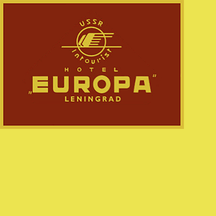
Talbot Type Kursk was inspired by the luggage label on the left, from Soviet-era Russia. Although it probably dates from the 1970s, it displays traits of Russian design from much earlier in the twentieth century — the lasting legacy of Constructivism.
I like the solidity and geometry of the letterforms in the word ‘Europa’, the more or less equal width of each of the characters; in particular the way the vertical strokes of the A feature shallow inclines, in order to maintain a width that matches the other characters. It feels as if each character has been allocated a square and then designed to fill it, so all the letters appear equal.
This is all very well for six characters, the challlenge in designing a full font means tackling more stubborn characters.
When considering the lower case characters, in order to maintain the compact look I’ve used shallow ascenders and descenders, in this way, there is only a subtle shift between capitals and lower case preserving the ‘square’ look.
One of the most distinctive fearues of the final font, is the sizeable notch where curved or angled strokes meet horizontal and vertical strokes. This uncompromising look, seemed to me to fit with the robust look of the font while preserving legibility at smaller sizes, so that it works as a text font.
I’ve ultimately created two variations Kursk 105 and 205, 105 is squarer following the U, R and P of the original design, while 205 features more curves yielding a softer result.
Find other fonts also tagged with:
Bauhaus / block / bold / Constructivist / display / geometric / headline / heavy / impact / logo / magazine / mechanical / poster / round / sans serif / strong / text / urban / utilitarian

