Eight wizards
jump quickly
over broken
fax machines.
Korbin
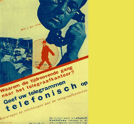
Talbot Type Korbin started when I stumbled upon the design on the left from 1927, by the pioneering Dutch designer Piet Zwart.
There’s nothing particularly remarkable about the font he’s using here, but I liked the proportions of the letters, and it was enough to get me started.
A font can be characterised by a couple of distinctive characters, and I like the uncompromising sheared terminal on the upper leg of the K (or is it an arm when it’s up there?). Another distinctive feature is a spur on the lower case a.
My primary objective was to come up with a classic sans-serif with old-style lower case a and g and I wanted a harmonious blend of humanist and geometric traits.
Presumably because they were hand drawn, many of those early twentieth century grotesque fonts have curiously idiosyncratic characters, a bit lumpy or uneven here and there, charming in retro style designs but I’ve evened things out here as this is no intended pastiche.
I’ve added a number of bespoke characters in the italic versions for a more flowing look.
Find other fonts also tagged with:
bold / childrens books / clean / clear / contemporary / cosmetics / elegant / friendly / geometric / Gothic / headline / heavy / humanist / kids / legible / logo / luxury goods / magazine / mechanical / metro / modern / modernism / newspaper / poster / retro / sans serif / signage / text / text and display / urban / utilitarian

