Eight wizards
jump quickly
over broken
fax machines.
Kittle Round
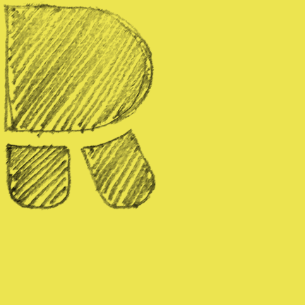
Talbot Type Kittle Round is a robust, pared down, geometric display font. Out of the blue, I had a vision of how the capital R should look and got started.
Some of the characters proved far more difficult – the 3 was one of them – and I had many attempts at them before settling on a design I was happy with. In order to create the purest forms, I aimed to use no more than two components for each character, although I occasionally used three and sometimes just one component, where it worked.
In recent years, I've designed a few minimal typefaces, Kittle Round is another of these. I'm fascinated by how minimally each letter of the alphabet can be represented, while still being easy to read, as well as easy on the eye.
I've created an alternative version of Kittle Round, called Kittle Rough. It's the same but with a time-worn texture. Such a robust design seemed capable of taking a texture, it lends the font an eco/recycled vibe.
Find other fonts also tagged with:
block / bold / brutal / casual / clean / contemporary / curved / display / fat / friendly / fun / geometric / graphic / headline / heavy / impact / kids / kids books / logo / magazine / mechanical / metro / minimalist / modern / nightclub / playful / poster / rhythm / rhythmic / round / rounded / sans serif / simple / soft / stencil / strong / stylish

