Eight wizards
jump quickly
over broken
fax machines.
Kitami
For Kitami, I've returned to the idea of a pared down, geometric sans-serif; it seems to be an area that fascintes me. Talbot Type Kampen was inspired by others attempts at a minimal typeface and for that I explored the square approach, more akin to Wim Crouwel's Neu Alphabet.
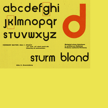
I guess Kitami is similar in concept to Kampen but is round where Kampen is square, so adheres more to the Universal Typeface by Herbert Bayer, when he was working at the Bauhaus in the 1920s.
His aim was to create a single style, that circumvented the need for separate upper and lower case sets. I think that was noble but ultimately doomed to failure, so have created both upper and lower case versions of Kitami.
I didn't intend for Kitami to be a stencil typeface but instead wanted each character to be described by a single stroke, or failing that a series of strokes but always as few as possible — for purity. The result is a typeface that could be described as a stencil font but I prefer to describe it as minimal.
Find other fonts also tagged with:
athletic / athletics / Bauhaus / bold / clean / clear / contemporary / curved / display / elegant / flowing / fluid / fun / geometric / graphic / headline / heavy / kids / legible / logo / machine / magazine / mechanical / metro / minimalist / modern / modernism / monoline / op art / optical / playful / poster / rhythm / rhythmic / round / rounded / sans serif / simple / soft / sport / sporty / stencil / stylish

