Eight wizards
jump quickly
over broken
fax machines.
Keith
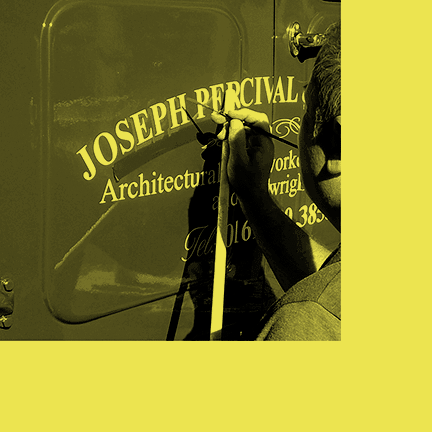
With the dawn of the digital era, all of 25 years ago now, we seemed to turn our back on many traditional crafts, seduced by the shiny new pixels.
In recent years, having got over our initial excitement, we’ve been finding time again for some of these more traditional crafts and reviving them to bring some sort of counter balance to proceedings.
The six different styles of Keith, based on the robust geometric sans Talbot Type Korto, can be combined in numerous ways, by layering the same message, to create a variety of different styles. I liked the idea of adding a textured layer in the form of the dot shadows, these offer a different kind of light and shade and can bring a pop art flavour to designs.
Traditionally, this style would have been applied to capitals only but with its clean geometric lines, Keith works well in lower case too — well I think it does.

