Eight wizards
jump quickly
over broken
fax machines.
Karben 105
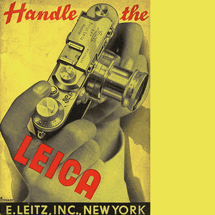
Talbot Type Karben owes something to the old Leica advertisement I came across, and something to DIN, with that German flair for order and a form that follows function.
Despite the enduring qualities of DIN, I felt it was worth an attempt at a similar font essentially based on a lozenge form.
I’ve created two variations: Karben 105 has a single storey a and g to match; while Karben 205 has a two storey a and an older style g. The 6 and the 9 vary in each as well.
It struck me that such an even, utilitarian font as this, would be well-suited to a monospaced variation, so I’ve created Karben 105 Mono and Karben 205 Mono. They look good to me, take a look and see what you think.
I liked the challenge of trying to design characters of such variable width, (compare i and m for example), to appear visually balanced in a fixed width font. It’s always going to create a slightly odd result, but odd
in a good way.
Find other fonts also tagged with:
clean / compressed / condensed / geometric / headline / heavy / legible / lozenge / machine / magazine / mechanical / metro / minimalist / modern / modernism / narrow / newspaper / sans serif / simple / strong / tall / technical / technology / text / text and display / urban / utilitarian

