Eight wizards
jump quickly
over broken
fax machines.
Kandel 105
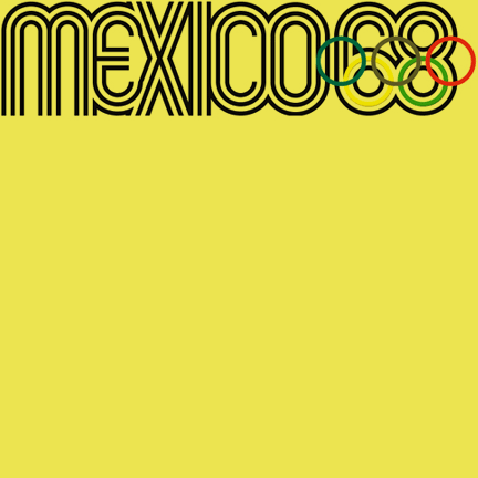
I’m a bit of a sucker for geometry and op art. Kandel is inspired to some extent by the Mexico 1968 Olympic Games graphics, designed by Lance Wyman (I can’t pretend I remembered his name, I did have to look it up). My first piece of printed design work, aged 17, was the cover of the college magazine, for which I drew a geometric design featuring the letters WSFC — Worthing Sixth Form College. From memory, I think it was a wonky version of Kandel.
Over time, the tri-line style has become associated with sport, which I think has much to do with the 1968 Olympic Games logo with its athletics track look, however I’ve not seen any attempts to develop the style into a practical font family, to include lower case characters too.
There are characters in Wyman’s original typeface that are, to my eye, too slavish to the lozenge form such as the E, F and K. Although Kandel is still built around a lozenge form, I’ve tried not to force it on characters opting instead for right angles where they seemed more appropriate. The result is intended to be a little less quirky and hopefully more practical and versatile.
I’ve developed two styles, Kandel 105 features sharper, more conventional joins at the corners of some characters (e.g. A, M, N, V, W, Y, v, w, y) while Kandel 205 offers more curvaceous corners.
They’re undeniably display fonts, don’t try using them to set any quantity of text.
Find other fonts also tagged with:
athletic / athletics / compressed / condensed / display / flowing / fluid / geometric / graphic / headline / linear / lozenge / machine / magazine / mechanical / metro / modern / modernism / modular / monoline / narrow / Olympics / op art / optical / outline / playful / poster / rhythm / rhythmic / round / sans serif / sport / sporty / strong / technical / technology / tri-line / triple line

