Eight wizards
jump quickly
over broken
fax machines.
K-haus 205
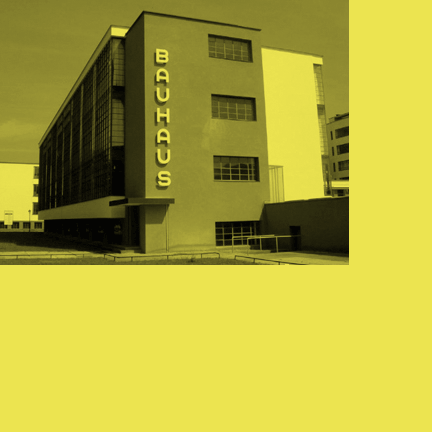
K-haus is inspired by the work of graphic designer and typographer, Herbert Bayer, during his time at the Bauhaus around 100 years ago — work that kick-started graphic design as we know it, to this day.
It owes something to the simple geometry of Bayer’s hand-drawn, ‘universal typeface’, updated and expanded to deliver a clean, balanced, geometric sans for today.
I've created two subtly different versions, 105 and 205. K-haus 205 features a few, more ‘daring’ characters here and there, chiefly in the lower case set.
Can’t help wondering what Herbert Bayer would make of the digital technology of today? Given the modern, progressive approach at the Bauhaus, I think he would embrace it.
Find other fonts also tagged with:
Bauhaus / bold / clean / clear / compressed / condensed / contemporary / display / geometric / graphic / headline / legible / logo / machine / magazine / mechanical / metro / minimalist / modern / modernism / monoline / narrow / poster / round / sans serif / simple / stylish / system / technical / technology / text / text and display / urban / utilitarian

